My second visit to the site a couple of days later is really all about just one thing, taking colour notes. I already have a strong design. Now I need to gather the rest of the essential information I need to take back to the studio.
In order for this painting to work, to really work, it has to have two things absolutely spot on.
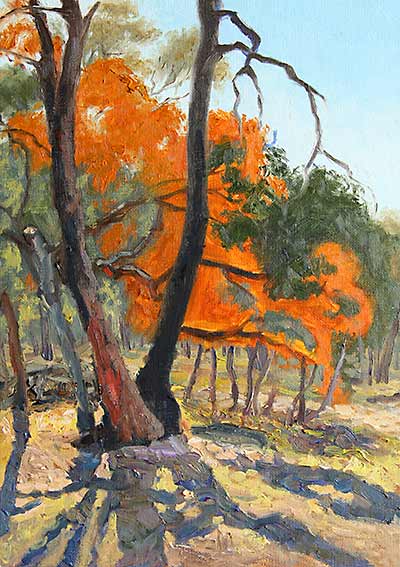
Firstly, the values have to be right. That is, the lights and darks, the contrast between the darkest elements and the lightest elements and the tonal position of everything in between has to be spot on to give the effect of back-lighting – where you are looking almost at a silhouette with strong light behind it.
The second thing is the colour. If the colours are not right, it’s not going to work! The whole thing has to glow with a sense of colour authenticity and the only way to get that is with the correct colours.
I can achieve both these goals by placing colour notes of the exact value, hue and saturation at critical points on all the major elements.
 I have to work very quickly, slapping the paint on fast and loose. If the colour is not right, then I have to put some more on thicker and stronger to cover it up and get it right. It’s not very neat on the canvas, but it sure is fun!
Before I am done I have to make sure I have colour references for all the essential elements, particularly the shadows on the ground and the trees around their bases. The foliage in the background isn’t quite as important because I can grey that off, but those central elements at the front, they are my main characters. If their colours don’t all relate properly together, I’m just not going to achieve the effect I’m after.
Not too long later as the light’s disappearing and I’m finished painting on the second outing, it looks as if I’ve started building some of the form on the tree trunks and other solid areas – but I haven’t. It is just the correct placement of colour building up the illusion of form. At this stage, I haven’t been concerned with rendering form – making things look solid. That will come later. All I’ve done is just record notes of colour here and there where I see it so I know that when I do come to build up those trunks, my colour references are right where they are meant to be.
So, job done. Later in the studio, I can mix paints to match these colours then work around and into them with confidence.