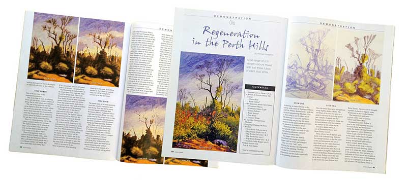
I have two new articles in the Artists Palette Magazine. One is semi biographical and the other is a demonstration in oils.
I want to add some more background information to the painting in the demonstration article as it resonates for me with a number of personal and emotive connections – particularly to my Dad.
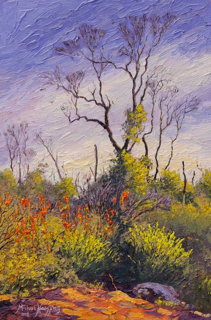
 I came across the subject when walking my dogs in the hills above Perth. Blackened sticks and burnt trees stuck eerily into the darkening sky whilst amongst them the regrowth greenery and riotous wild-flowers of spring were bursting out everywhere in the late afternoon sunshine. Such is the aftermath of bush fires and nature in general. There is always the new coming through from the old.
But there is more to the story than that.
Moody Blues
 When my artist father passed away I inherited all his painting equipment, brushes and paints, a considerable bounty. Some of these paints were familiar to me as we had often swapped tips and paints and they just fell into my box to be used along with my regular arsenal. The brushes that were his are now some of my prized tools that give me great pleasure to use knowing that once they were in his hands too, crafting his paintings.
However, there were some items, particularly tubes of paint, that fitted nowhere in my processes so they just went into the draw to be looked at and played with some day. That time came when I was looking at the photograph that this painting was derived from. I thought “this painting needs a mood, something sad but uplifting at the same time”. I wanted to experience it differently too in order to build on that emotion so I thought of moving outside of my normal familiar palette choices.
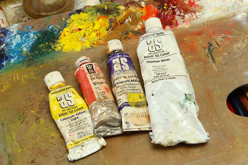
I remembered my Dad’s paints sitting in the drawer waiting. From them I selected Winsor Red and Permanent Mauve, two paints I had never used before. I imagined the strong moody mauve/blues and deep purples that would come from this melding and added one tube that was familiar to me in order to balance out the colour scape, Cadmium Yellow Light.
With the addition of Titanium White I quickly painted a small experimental study using this limited palette of three colours. The result was exactly what I had in mind. Not only had these paints enabled me to capture the sense of melancholy I wanted, but the counterpoint of vibrant happy reds, yellows, oranges and spring greens were all there too – from just three tubes of paint and some white. I left the study then thinking that at some time in the future I would use it to make a full size painting.
Painting From Photographs
When Artists Palette invited me to paint another demonstration for the magazine I thought about what I could do that would provide a lot of learning material for readers. This subject came to mind for multiple reasons.
There are a number of lessons to be learned here about painting from a photograph.
- I applied a limited palette of just three colours. Without even trying really, nothing too horrifically gaudy can be mixed that would destroy the harmony of the painting. What is there has to be stretched to the limits to get the highlights and the exercise of mixing basics such as black, earth colours, greys, natural greens and such from only three primaries is invaluable practice for artists.
- I didn’t slavishly copy the reference photograph. I improvised and changed some elements around to improve the composition. There are no clouds in the sky in the photo and much of the arrangement of shadows I used in the painting is different to the photo. I simplified the number of tree branches to be only enough to do the job. I put sunlight in the foreground where there wasn’t any. A photo is a reference or starting point for a painting. If you don’t want to change the image in the photo in any way, then forget about painting it. What you have is a great photo, so get it blown up and hang that on your wall!
- I wasn’t quite sure how this subject would work so I used a postcard sized study to mess around with the colour mixes and composition before even attempting anything larger. I got it right in small scale where changes are easy to make and materials aren’t wasted.
- I was intimately familiar with what I was painting. Yes, it was from a photograph. But I know that bush. I walked there all the time. I knew what if felt like, smelt like and the noises that were there. I believe this to be an important element of using photographs. Firstly and most importantly, if you haven’t been there in real life, then don’t paint it! Your painting will struggle for authenticity because you will have no emotional or memory connection to the things that you will be painting. Your best paintings from photographs will come from subjects that you already know.
- I could have chosen any three colours or more to render this image and the only thing that would have changed is the mood. I didn’t try to copy the colours in the photograph. They are just there as a guide – this green is yellower and lighter than that green, this section is warmer or cooler than that etc. Every print or computer monitor will display your photo with a different colour gamut anyway so trying to slavishly copy the output of a machine seems rather pointless. Take control of the colour choices yourself using your own palette. If you want to try following this demonstration, use three colours of your choice if you don’t have the same ones I used.
- You will notice that I didn’t stick to this limited palette in the under-painting. I could have mixed everything used there from three tubes plus white but it was entirely unnecessary. I wanted fast drying, transparent paints for that part of the painting and as none of them would be left visible through the upper layers, it made no difference to the finished effect. The benefit was that these stages were completed with more economical paint and a lot faster!
So that’s it. A vibrant painting that has a strong emotional connection for me on multiple levels and at the same time provides an excellent learning opportunity for the student. If you would like to read through the demonstration and follow all the steps of creating the painting then please purchase a copy of the November 2015, Issue 144 Artists Palette Magazine which is available at normal magazine outlets and online.